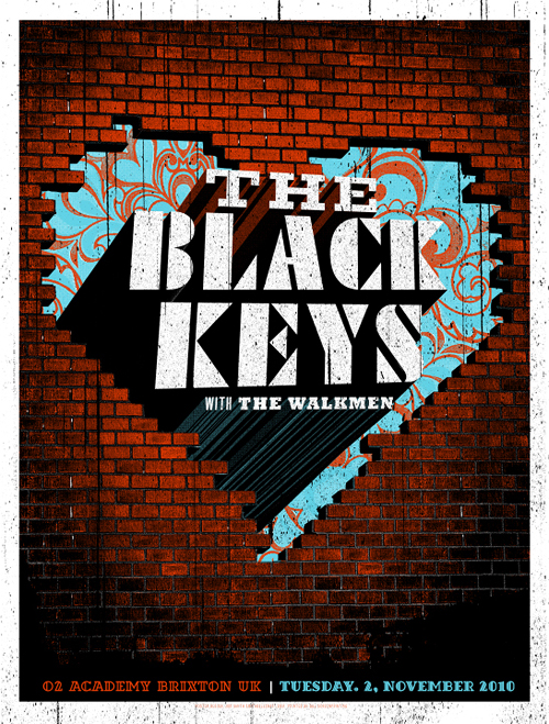
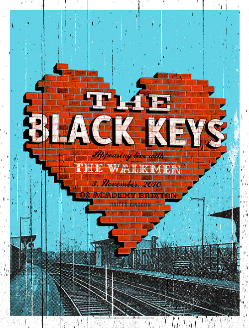
THE BLACK KEYS UK.
So here’s the deal, I started writing this last night. It was going pretty good(I was my usual clever self) but this hunk a junk PC of mine took a dump in my face, nothing was saved. So this’ll be pretty bare bones, just the facts ma’am:
Here we have not one but two new posters for The Black Keys, for back to back shows at Brixton Academy in the UK!!! If you know me you know I’m a sucker for anything British(except that new David Cross show which sucks but I guess is made my Americans though…shit! A tangent for another time, gotta keep it movin) so I was pleased as punch to be asked to throw a design together for these shows.
From a design standpoint I wanted to have a “2 part” concept where each poster would stand on their own but also look good and make sense side by side. I think this is what one of my old design teachers would call “pop out”…I think.
So there’s that and I was trying to make it feel right for shows in the UK. I’ve been to London and Brighton, I was only there for about a week about 5 years ago so it’s not like I’m claiming dual citizenship here but I think it helped in the design process a little. If nothing else it just helped me to not overdo it and make it an obvious “this is a poster for a show in the UK by some yank from Seattle” deal.
I managed to avoid obvious references like The Guns of Brixton, The Union Jack, Monty Python, a can of Boddingtons or the power station from the cover of Pink Floyd’s Animals 😉
I think that’s all I have time for internet, here’s the technical skinny:
3 colors including a subtle metallic flake in the brick red.


1 Comment
Jon, these look awesome.