3 new Showbox posters: The Sonics, Ben Folds Five, Ellie Goulding.
Boom, internet.
Three posters for three shows happening within a day or two of each other(ALL AVAILABLE IN THE STORE NOW). Hadn’t did me a gig poster in a dogs age and I had to crank these things out in a little over a week, it’s like running wind sprints without stretching first. I don’t recommend it.
I’m experimenting, compiling screen grabs while I work to capture the progress of a design or at least illustrate my ridiculous mad cave man approach to photoshop and illustrator. This is quick and rough, if I do this again it’ll be better but it’s enough to get a glipse at how the sausage is made:
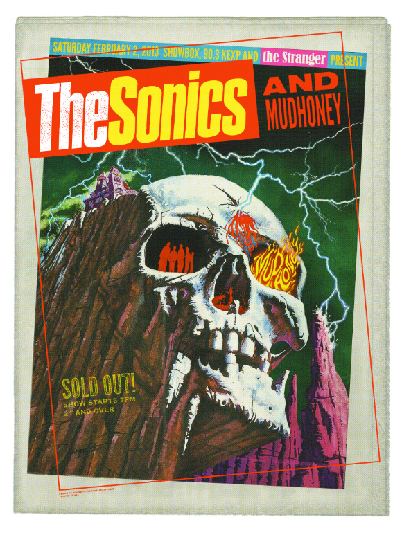
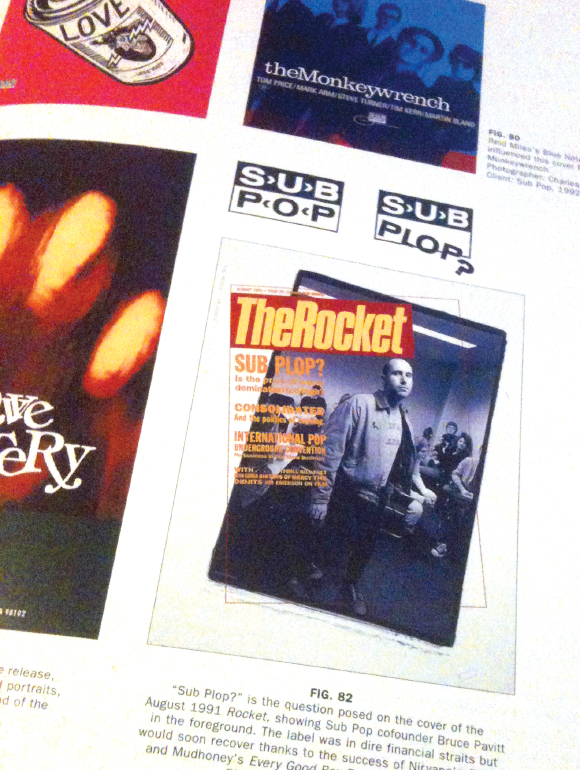
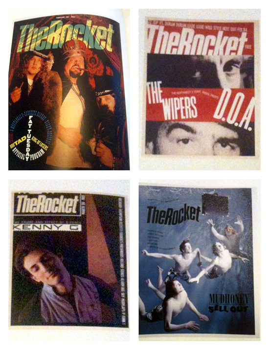
The Sonics and Mudhoney concept started from a place of wanting to do something that embraces the northwest and if possible represent multiple generations. One thing leads to another and I end up with a concept of an homage to the local rag The Rocket which became The Stranger like fifteen years ago? Something like that. Art Chantry was the head honcho art director at The Rocket, at some point Jeff Kleinsmith enters the picture as Art’s assistant and the rest is history. The Joe Montana and Steve Young of rock/punk/indie music design, it’s been all downhill since in Seattle..I mean if they’re letting me make posters, the scene is dead mannnnn.
I figure I had Chantry stuck in my head because he’s done some work on Sonics posters and or reissues at Estrus or Sub Pop I can’t remember. I got cute and hid the cover of Art’s book in the blood in the skull’s nose. The imagery is pretty much random, I tweaked an old VHS cover, I liked it cuz it had a slight spooky vibe and it’s weird. If I had more time I would have made it weirder.
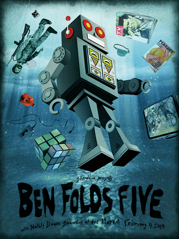
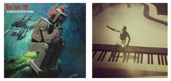
The Ben Folds Five design came from two things. The cover of the new album and a picture of Liberace and his pool.
I came across this picture in an old book and joked on instagram that I had found the key to my Ben Folds Five design, but the idea of a pool stuck in my head for some reason. The design evolved into an extrapolation* of the robot from the album cover floating in a swimming pool full of nostalgic toys of the 70’s and 80’s plus a few visual song references: a fanny pack, Rockford Files, a Playboy from “September ’75” and a “badass mother g.i joe”.
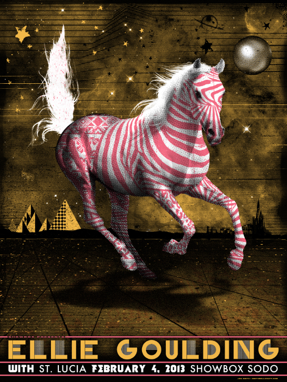
On the Ellie Goulding poster I just wanted to do something that fit without overthinking it, something with girly elements(metallic gold and pink ink) but hopefully mysterious enough to make it somewhat original…have you ever made a pink zebra/pony? That’s what I thought, numbnuts.
On all three of these I didn’t have time to screw around too much which was mostly advantageous. Think hard, go with whatever seems like the best idea and make the most of it, there’s no time to scrap it and start over or cook up some idea that’s too detailed and convoluted to do in 1-3 days.
All done, going to bed. XOXO
*I may not know the definition of the word extrapolate


0 Comments
You can be the first one to leave a comment.